
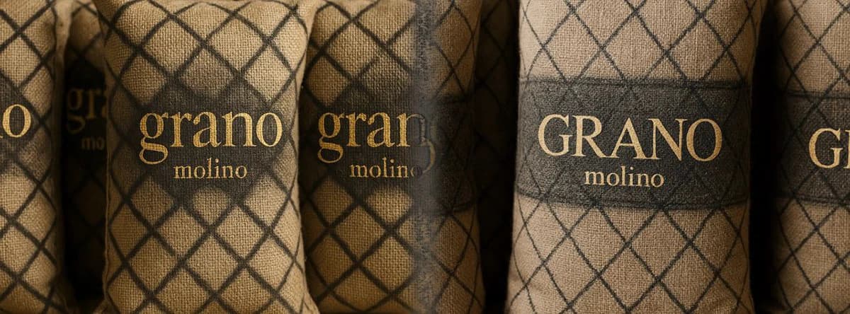
In 2022, an old client called me with a problem that had very little to do with design.
They are a large Ukrainian agricultural company. They grow grain, operate a major milling business and export flour.
After Russia's full-scale invasion of Ukraine, the economics of agricultural exports changed dramatically. Maritime logistics became disrupted and expensive, and moving low-margin commodities became considerably more difficult.
Processed products such as flour made more commercial sense.
But flour came with another problem.
It is an extremely competitive product.
In many export markets, several sacks from different producers can sit next to each other with broadly comparable quality and broadly comparable prices. There is very little reason for a buyer to choose one rather than another.
And competing simply by lowering the price was not a realistic strategy. Logistics were already expensive enough.
The client called me informally.
There was no consulting contract, no formal brief and no presentation to prepare.
It was essentially:
What do you think we could do?
Looking at the thing everyone ignores
I started thinking about what was already present in every sale.
Not the flour.
The sack.
Every producer was already paying for packaging. Every sack already had to be manufactured and printed.
So changing the graphics did not fundamentally change the economics of the product.
And I remembered something I had seen years earlier.
In lower-income markets, commodity sacks are not always treated as disposable packaging after they are emptied. They can be reused for household objects, bags and clothing.
At the same time, younger consumers almost everywhere now see the same global fashion culture online.
They know luxury brands.
They recognise monograms.
They recognise certain patterns, stripes and visual codes even if the actual products are far outside their purchasing power.
That suggested a different question.
What if the flour sack was designed not only for its first use, but also for its second?
Flour packaging as fashion material
My suggestion was to print the sacks in a way that borrowed the visual grammar of luxury fashion.
Not by copying Gucci, Louis Vuitton, Burberry or any other brand.
The client's own brand would remain clearly visible.
But we could use some of the same visual principles:
- repeating patterns,
- monogram-like structures,
- distinctive stripes,
- decorative symbols,
- large typography,
- and graphics that would still look intentional after the sack had been cut apart.
In other words, treat an industrial flour sack almost as if it were printed fabric.
I made a few quick visual concepts to demonstrate the idea.
They were deliberately exaggerated. Their purpose was not to produce a final fashion collection, but to make the concept immediately understandable.
The client decided to test it with a small production batch.
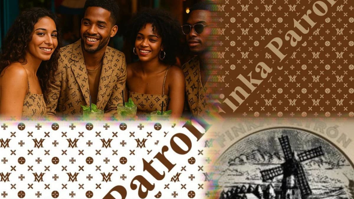
Finka Patron: a visual concept showing how a sack pattern could carry into its second use.
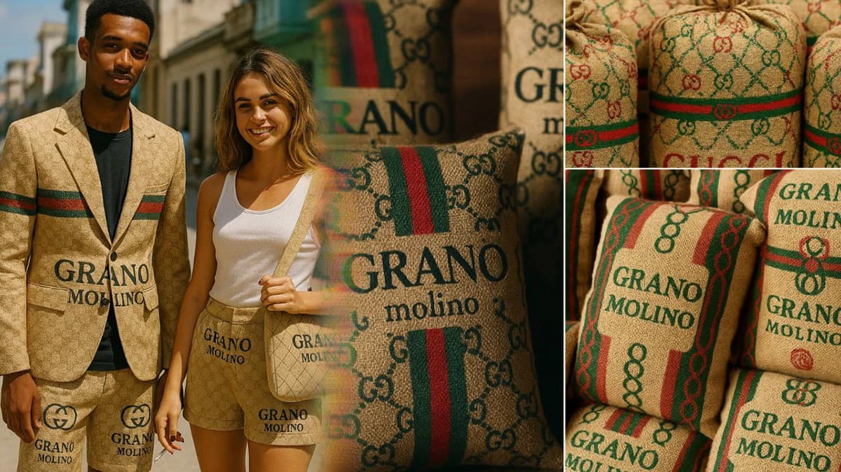
Grano Molino: packaging and clothing concepts built around the same visual language.
The flour did not change
That is the part I like most about this case.
Nothing changed inside the sack.
The flour was the same.
The production process was the same.
There was no discount.
There was no expensive advertising campaign.
The company did not need to invent a new functional advantage that its competitors could copy six months later.
We simply changed the value of something that already had to exist.
Before, the sack became waste once the flour was gone.
Now it could potentially become a bag, clothing or another reusable object.
And that changed the purchasing decision.
If two products are reasonably similar and one comes with packaging that someone actually wants to keep, the products are no longer completely equivalent.
The client told me that the experimental sacks began moving much faster than their ordinary packaging.
A commodity had acquired a small competitive advantage without changing the commodity itself.
Packaging as a drop
I also suggested that they should not keep one successful design forever.
The novelty was part of the value.
So the packaging could behave more like fashion collections.
Produce one visual direction for a period.
Then change it.
One batch might use a visual language inspired by one type of European luxury aesthetic. The next could move in a completely different direction.
The exact references could also vary by market.
A visual code immediately associated with luxury in one country may be almost meaningless somewhere else.
That meant packaging could become geographically adaptive as well.
The client continued developing the approach, and variations of the idea have remained in use for several years.
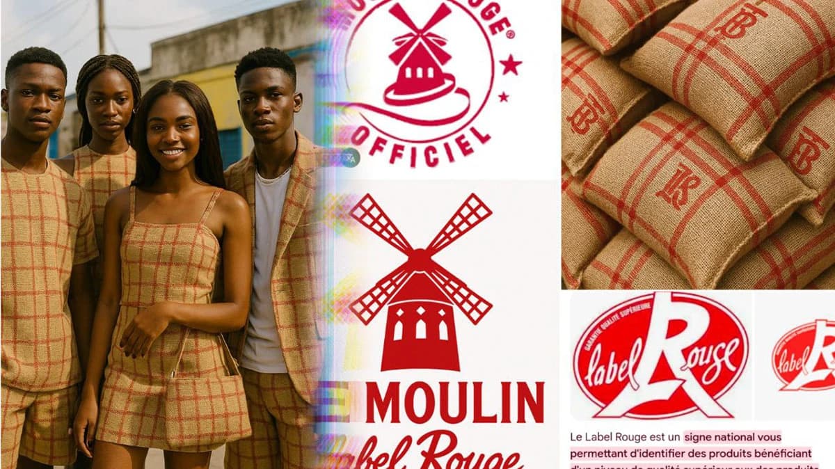
A different visual direction: red checks and windmill graphics across packaging and reuse concepts.
The useful part was not graphic design
It would be easy to describe this as a packaging-design case.
I think that misses the interesting part.
The real problem was:
How do you differentiate a commodity when price and product quality leave very little room to manoeuvre?
The answer did not have to be inside the flour.
It came from looking at an unavoidable cost, the sack, and asking whether that cost could become part of the value proposition.
A flour sack normally stops being useful when it becomes empty.
We designed it so that emptying the sack could be the beginning of its second use.
And that gave someone a reason to choose the flour before the sack was empty.