
In 2019, I developed Anderson, a Dutch-inspired coffee-and-cheese café concept for a Ukrainian retail chain. The client accepted it. The café was never built. Seven years later, I still consider it one of my most coherent hospitality projects.
There's a particular kind of project that stays with you long after the work is finished.
Not necessarily because it was a commercial success.
Not because it won awards, attracted investors, or became a familiar name on the high street.
Sometimes it's because everything simply fitted together.
The business idea.
The positioning.
The name.
The visual identity.
The products.
Even the seemingly boring operational details.
I have one such project from 2019.
It was called Anderson.
A Dutch-inspired coffeehouse developed for Cheese Kingdom (Syrnoye Korolevstvo), a Ukrainian retail chain specialising in Dutch cheeses.
The concept was presented to the client and accepted.
But it never reached implementation.
I don't know why.
There are no photographs of a finished Anderson café. No opening-day crowds, no revenue figures, no customer reviews.
What I do have is the original concept presentation, including the branding, menu architecture, operational thinking, and the visual world I designed around the business.
And looking at it again seven years later, I still consider it one of the most complete concepts I've developed.
Here's why.
A cheese retailer doesn't necessarily need another cheese shop
The starting point was an existing Ukrainian retail business.
Cheese Kingdom specialised in cheese, particularly Dutch varieties.
The task was to explore expansion into hospitality while reinforcing the retailer's existing positioning and distinctiveness.
One obvious approach would have been to open a café attached to a cheese shop.
Put a few tables somewhere.
Install a coffee machine.
Sell sandwiches.
Call it an additional service.
But I was interested in something more substantial.
What if the expertise that made a specialist cheese shop recognisable could become the foundation of a completely separate hospitality concept?
Not simply another place to buy cheese.
A place to experience it.
To have breakfast.
To meet somebody for coffee.
To eat a dessert.
To order a light lunch.
And to encounter cheese in combinations customers might not ordinarily consider when standing in front of a supermarket refrigerator.
This distinction was important to the idea.
A retailer's relationship with its customers is often built around a shopping occasion.
You need something.
You visit the shop.
You buy it.
You leave.
A café creates different occasions.
You might visit because you're hungry, because you want coffee, because you're meeting a friend, or because you simply feel like sitting somewhere pleasant for half an hour.
If designed properly, the hospitality business could introduce customers to the retailer's product world through an entirely different experience.
That was the opportunity I wanted to explore.
The question was what kind of café could make this relationship feel natural rather than forced.
The Netherlands was already part of the brand's story
When your existing business specialises in Dutch cheeses, you have a rather useful starting point for positioning.
The Netherlands.
It comes with a wealth of recognisable cultural associations.
Blue-and-white ceramics.
Bright interiors.
Domestic warmth.
Dairy products.
Traditional sweets.
And, naturally, coffee.
I started exploring a Dutch and broader Northern European coffeehouse concept.
The idea wasn't to create an ethnographically accurate reconstruction of a café in Amsterdam.
I wanted a recognisable and commercially useful atmosphere.
Something warm and familiar.
European, but not intimidating.
Homely, but not shabby.
A place where a cup of coffee, a slice of cake, and a piece of cheese could sit together without anybody finding the combination particularly strange.
This was partly a positioning decision.
The Dutch inspiration connected the new café to Cheese Kingdom's principal product specialisation.
But it was also a way to escape the endless world of generic coffee shops.
Another industrial-looking café with black furniture, exposed brickwork, and a motivational slogan about caffeine wasn't particularly interesting to me.
I wanted something with a distinct personality.
A slightly old-fashioned, gently whimsical idea of Northern European domestic comfort.
Which eventually led to the name.
Anderson: a little fairy tale with your coffee
I called the concept Anderson.
The name was intended to feel familiar, warm, and faintly fairy-tale-like.
It evoked the kind of European storybook atmosphere I wanted for the place.
A comfortable room.
A cup of hot coffee.
Something sweet.
Perhaps bread with cheese and jam.
Nothing especially grand.
And that was rather the point.
I wasn't designing an expensive restaurant pretending to be a cultural institution.
I was designing an approachable café.
In the presentation, I developed several possible visual identities.
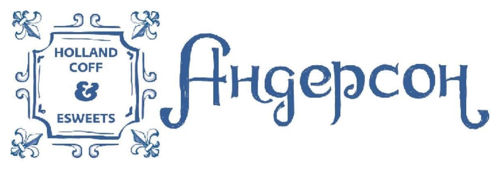
One used an ornamental frame and a stylised blue wordmark.
Another introduced an illustration of a coffee cup and cheese inside the decorative frame.
A third explored a character-based identity with a figure in traditional-looking Dutch clothing.
The versions weren't identical, but they belonged to the same visual world.
The colour palette was particularly important.
Blue and white.
Inspired by traditional Dutch ceramics.
Against that cool background, I wanted the products themselves to provide warmth.
Golden cheese.
Brown coffee.
Caramel.
Fresh pastries.
Chocolate.
The contrast was deliberate.
The interior shouldn't compete with the food. It should make the food look better.
I liked that relationship.
The same cultural reference helped explain the branding, the colour scheme, the atmosphere, and the products.
They weren't separate decorative decisions.
They supported one another.
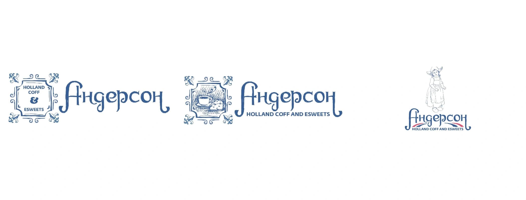
Original identity directions developed in 2019.
The interior was supposed to help sell the product
The interior concept continued the same logic.
Bright spaces.
White surfaces.
Light wood.
Blue-and-white decorative elements.
Ceramic tiles.
Some floral motifs.
A Northern European domestic atmosphere, refined into something suitable for a contemporary urban café.
The original presentation included several reference images, but those were mood-board references, not photographs of a designed or completed Anderson interior.
The actual intention was more specific than simply making a room look pleasant.
I wanted products to be highly visible.
Cheese.
Coffee.
Desserts.
Pastries.
The displays were supposed to form an important part of the interior rather than being tucked away somewhere behind a counter.
Much of the assortment would also be available for takeaway.
This gave the café a useful retail dimension without turning it back into an ordinary cheese shop.
A customer might come in for coffee and leave with something to take home.
Or come in to buy a product and decide to sit down.
Again, this was a proposed commercial interaction, not a measured result.
But it guided the design.
The original technical brief also went beyond interior references.
I considered premises of approximately 80–150 square metres, electrical capacity in the 35–65 kW range, water and sewage requirements, and the importance of a bright, straightforward layout with good windows.
These weren't final engineering specifications.
They were early operational parameters intended to connect the desired format with the kinds of premises in which it might realistically operate.
Because a lovely café concept is considerably less lovely when nobody can actually install the equipment.
What happens when you put cheese at the centre of a coffeehouse?
Now comes the more entertaining part.
The menu.
It would have been easy to design a conventional coffee-shop assortment and add a couple of cheese sandwiches.
But that wouldn't have done much to justify the concept.
I wanted cheese to appear across different eating occasions.
Not everywhere.
Not in every product.
But often enough to become recognisable.
So the initial menu exploration included cheese sandwiches, cheese soup, cheese fondue, waffles, cheesecakes, puddings, and even cheese ice cream.
Alongside them: pastries, pies, sweets, chocolate, traditional imported products such as stroopwafels, and various assembled desserts.
Some dishes would require preparation.
Others could be purchased ready-made or assembled from existing components.
The idea wasn't to build a giant restaurant menu.
Quite the opposite.
The presentation explicitly proposed reducing the exploratory assortment by two or three times after product and technology development.
This was a list of possibilities from which a working menu would be selected.
Not a claim that dozens of fully tested recipes already existed.
And that's an important distinction in concept development.
First, you explore what the format could become.
Then you reduce the possibilities into something operationally manageable.
The interesting challenge was how to make the different products feel like they belonged to the same place.
A cheese sandwich and a cheesecake may seem like entirely different categories.
But under a coffee-and-cheese positioning, they can become parts of the same experience.
And that relationship was much more interesting to me than simply selling more varieties of sandwiches.
The coffee needed its own ritual
There was also a small but important decision about the coffee.
Naturally, the concept included espresso, cappuccino, other familiar coffee drinks, tea, cocoa, and hot chocolate.
Nothing revolutionary there.
But I wanted one particular style of coffee service to become a signature.
Dutch-style filter coffee.
Served in a coffee pot, with milk separately in a small jug.
A simple, recognisable ritual.
The customer doesn't just receive another paper cup.
There's a little coffee pot.
A milk jug.
A reason to sit down.
Perhaps something sweet or savoury alongside it.
I intended to make that service the most actively promoted coffee option, including it in breakfast and lunch combinations.
Of course, calling it Dutch-style coffee service didn't mean inventing a new brewing technology.
The value was in the presentation, the association, and the way it fitted the broader experience.
This is something I find important in hospitality concepts.
A signature product doesn't always have to be technically extraordinary.
Sometimes an ordinary product becomes distinctive because of how it is served, combined, and understood within the brand.
The coffee pot was a small detail.
But it helped complete the atmosphere.
One concept. Two different-sized businesses.
The part of Anderson I find particularly interesting today isn't actually the branding.
It's the operational model.
Because from the beginning, I was thinking about how the concept might work in more than one kind of location.
The presentation proposed two formats.
A larger café with a proper kitchen.
And a smaller version without a fully equipped kitchen.
The core brand would remain the same.
The customer proposition would remain recognisable.
But the assortment and the method of preparation could be adapted.
That required a modular menu.
Some products would be bought ready-made.
Others assembled on site.
Some baked or cooked in the larger format.
Other items potentially prepared using more compact equipment.
I was even exploring microwave-based cooking for certain dishes.
Not because I thought microwaves were the pinnacle of European gastronomy.
But because equipment, kitchen area, staff requirements, and preparation times affect whether a hospitality concept can be replicated economically.
A small café may not have the space, ventilation, or budget for a complete professional kitchen.
That doesn't automatically mean it should be restricted to selling packaged biscuits.
The question was whether a carefully designed assortment could give both formats enough product variety without requiring identical infrastructure.
We hadn't proved that it could.
The original concept explicitly left the microwave-based kitchen approach to be tested.
But the intention was clear.
Build a format that could adapt to different premises without losing its identity.
That's a different problem from designing a beautiful single-location café.
And considerably more interesting from the perspective of business development.
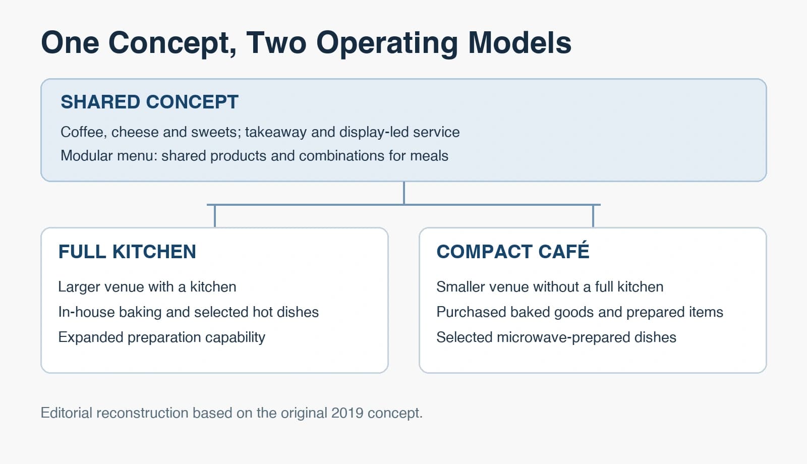
Editorial reconstruction based on the original 2019 concept.
Breakfast, lunch and dinner without three separate menus
Another small idea in the presentation concerned meal combinations.
Breakfast.
Lunch.
Dinner.
Rather than developing completely separate menus for each part of the day, I proposed creating combinations from existing products.
Coffee with a pastry.
A sandwich with a drink.
A soup and something else.
Different offers built from the same underlying assortment.
From the customer's perspective, the café could address different needs at different times.
From the operator's perspective, the objective was to avoid unnecessary assortment complexity.
Fewer distinct ingredients.
More opportunities to combine them.
A clearer role for each product.
Again, this was a design hypothesis, not a demonstrated improvement in food costs or kitchen efficiency.
But it illustrates the kind of thinking behind the project.
I didn't want to design a café that needed a new kitchen operation every time somebody thought of another attractive menu item.
I wanted a system.
One where the menu, equipment, service model, and brand promise could coexist.
Even the service model followed the same logic
The concept proposed counter ordering and a largely self-service approach.
Staff could still bring something to the table when appropriate and clear used dishes.
But the idea wasn't to create the labour requirements of a full-service restaurant for a business whose core proposition was coffee, desserts, and relatively simple meals.
The atmosphere was supposed to feel comfortable and welcoming.
The operating model needed to remain practical.
The two things don't necessarily contradict each other.
A customer can enjoy a warm, well-designed environment without having a waiter formally present every course.
The presentation also explored staff uniforms inspired by traditional Dutch clothing.
Looking back, that's one of the details I would probably reconsider today.
The overall visual world still makes sense to me.
But some of the more theatrical and gender-specific aspects of the original concept belong quite clearly to its 2019 context.
I would approach those elements differently now.
Which is perfectly normal.
Seven years is a long time in hospitality, branding, and cultural expectations.
An old concept doesn't have to be treated as sacred to remain valuable.
What I believe made Anderson coherent
Looking at the presentation today, I can see several things that would still need proper commercial validation.
The exact menu.
The food preparation methods.
Kitchen capacity.
Unit economics.
Customer demand.
The relationship between the Anderson brand and the parent retail chain.
In particular, the independent brand identity raised a question that would have needed resolution during implementation.
How visibly should Anderson be connected to Cheese Kingdom?
The new café needed its own personality.
But part of its strategic value came from reinforcing an existing retail business.
That relationship would have required careful development in real-world communications.
I don't regard these open questions as evidence that the concept was incomplete in every sense.
I regard them as the normal boundary between concept design and implementation.
Anderson was a developed business-format proposal.
It wasn't a finished operating restaurant.
What makes me value it is something else.
The decisions were connected.
The retailer's existing specialisation suggested a Dutch-inspired hospitality positioning.
That positioning influenced the name and visual identity.
The identity shaped the intended atmosphere and product presentation.
The product concept gave cheese a meaningful role throughout the menu.
The menu led to questions about preparation, equipment, and staffing.
Those operational requirements led to a modular approach with two possible venue formats.
And the proposed meal combinations were intended to expand the customer's reasons to visit without multiplying the assortment unnecessarily.
One decision led to another.
That, to me, is what makes a concept coherent.
Not the number of slides.
Not the number of logo variations.
Not how attractive the mood board looks.
It's whether the individual decisions belong to the same business idea.
The concept was accepted. The café never opened.
The project was developed in 2019.
I presented it to Cheese Kingdom.
The concept was accepted by the client.
And then it never proceeded to implementation.
I don't know the reasons.
There may have been financial considerations.
There may have been other business priorities.
The circumstances may simply have changed.
But I have no evidence to establish any particular explanation, so I won't invent one.
And I certainly won't claim that the project succeeded commercially.
There was no operating café to measure.
No actual customer response.
No proof that the modular format would have worked as intended.
These things remain unknown.
But the lack of implementation doesn't erase the design work.
Nor does it turn an accepted concept into a failed restaurant.
There never was a restaurant to fail.
There was a hospitality concept, developed for an existing business, accepted by the client, and never brought to market.
Those are the facts.
Seven years later
I've worked on many different concepts over the years.
Some reached implementation.
Others changed direction.
Some remained presentations.
Anderson is one of the latter.
Yet I still think about it rather fondly.
Not because I'm convinced it would have become a wildly successful café chain.
I have no way of knowing that.
But because it represents an approach to business design that I continue to value.
Start with what makes a business distinctive.
Look for a new context in which that advantage might become valuable.
Give the new proposition its own recognisable identity.
Make the product experience support the positioning.
And think about operational feasibility before declaring the creative work finished.
Anderson was never just a logo.
Nor was it simply a nice café interior with some cheese sandwiches.
It was an attempt to turn an existing product specialisation into a new business format.
From cheese retail to hospitality.
From Dutch cheeses to a Dutch-inspired coffeehouse.
From a brand idea to a proposed customer experience and operating model.
It might have worked.
It might have required substantial changes after opening.
We'll never know.
But seven years later, I can still trace the reasoning behind the decisions, and I still like how they fit together.
Not every good concept becomes a business.
And not every business concept needs to have opened its doors to demonstrate the thinking behind them.